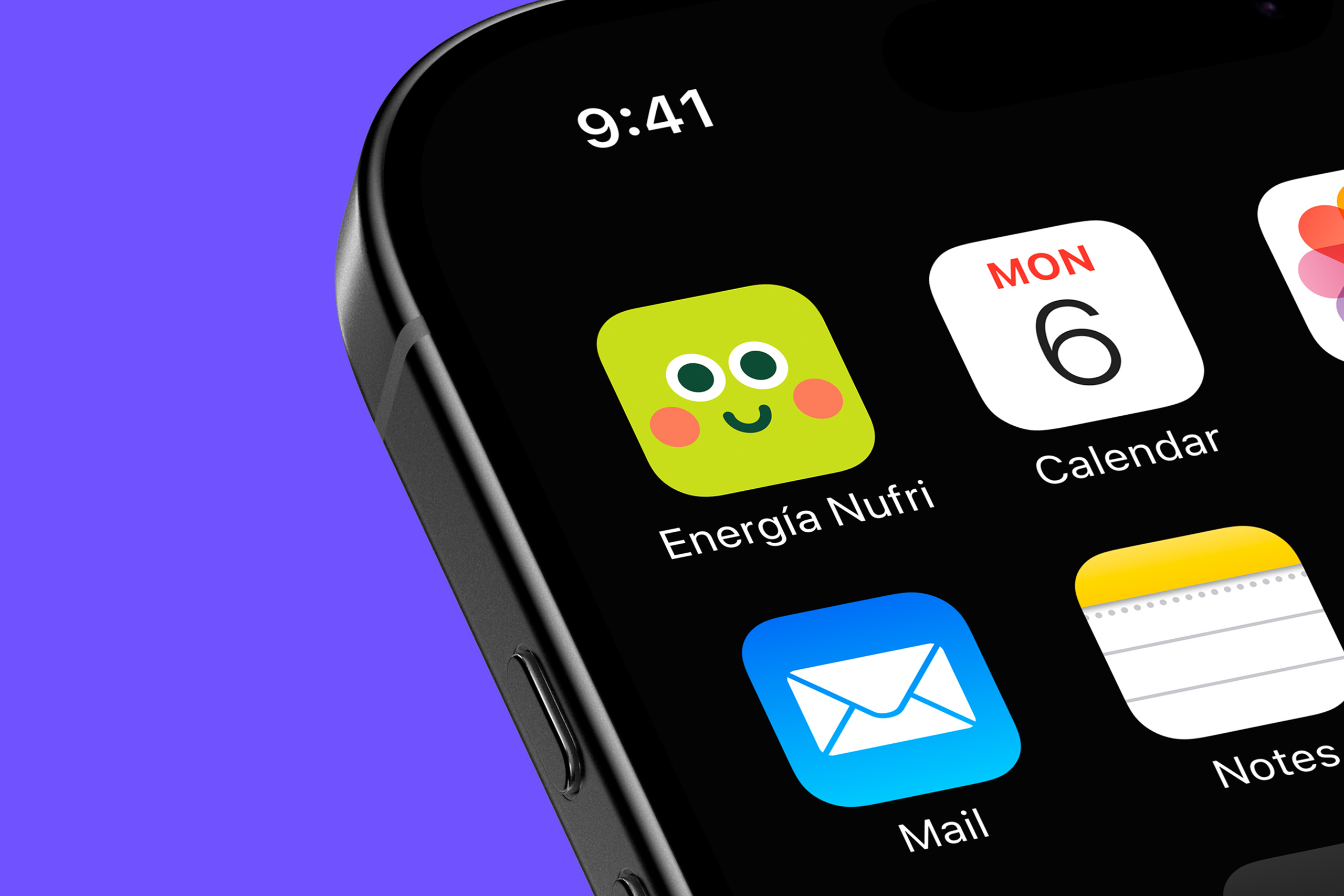
Nufri Energy Character Design
Created in collaboration with Runroom, and as part of the brand repositioning project they were leading, this character system was developed for Energía Nufri, the Nufri Group’s energy company specialising in renewable energy and self-consumption solutions.
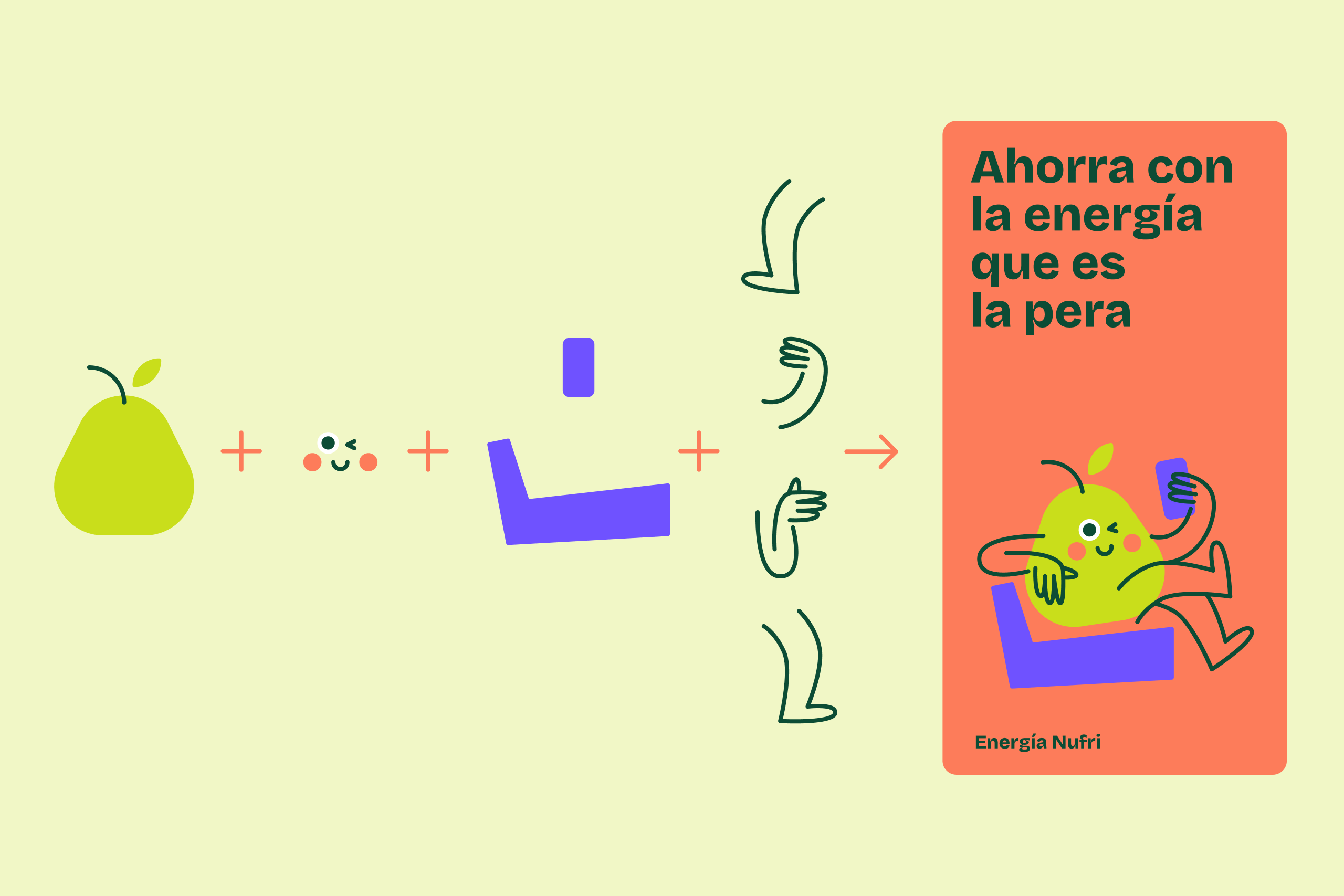
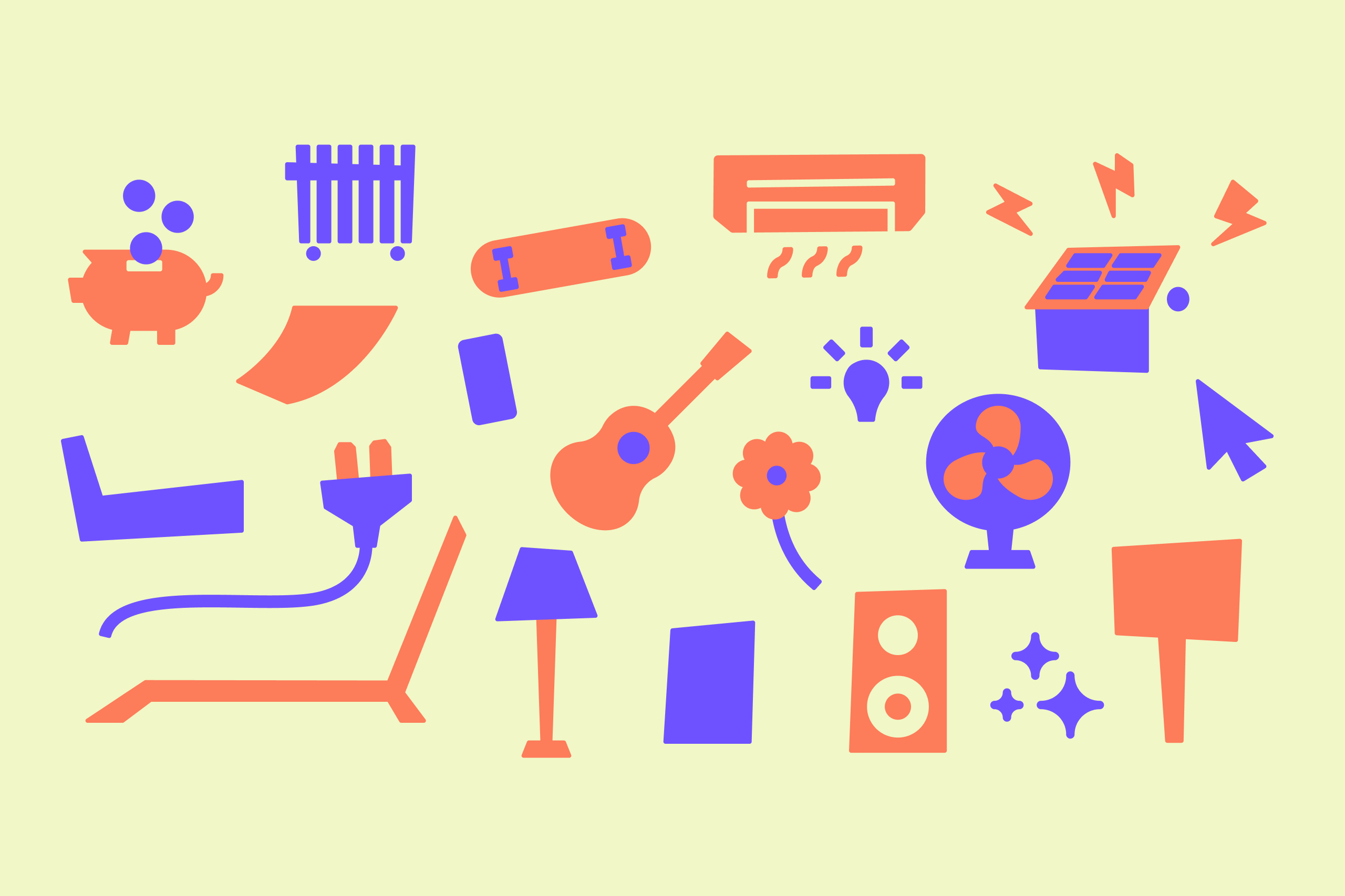
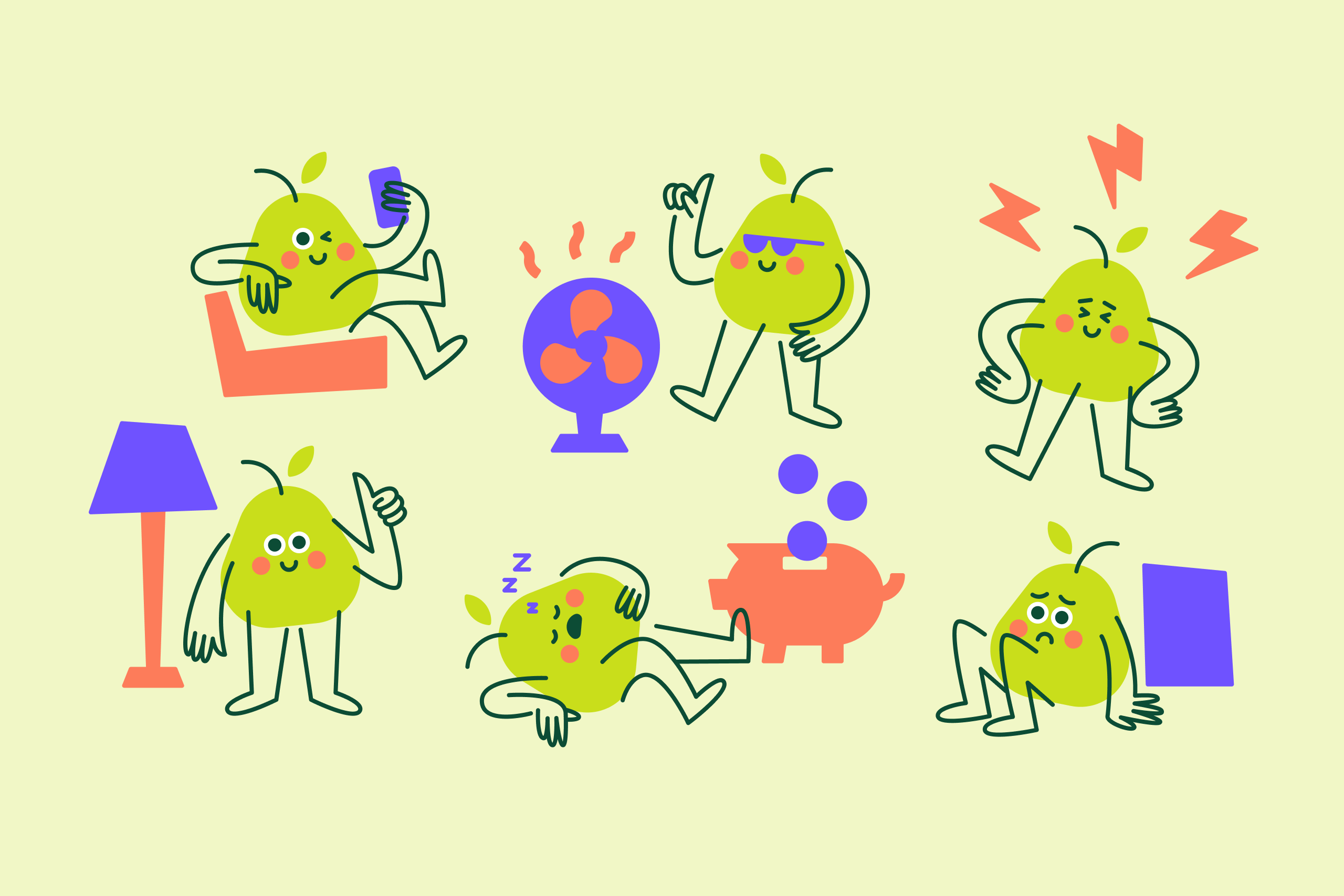
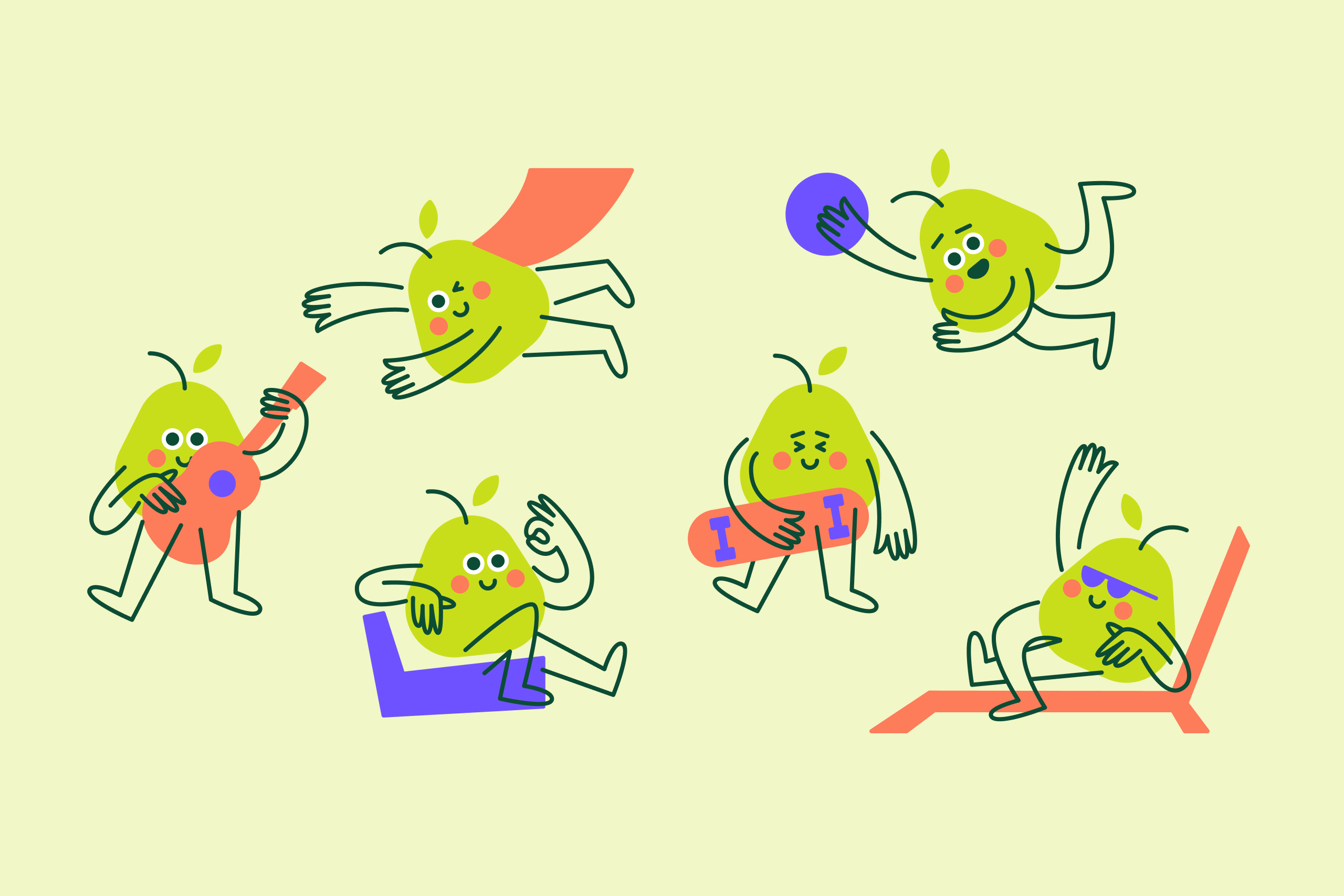
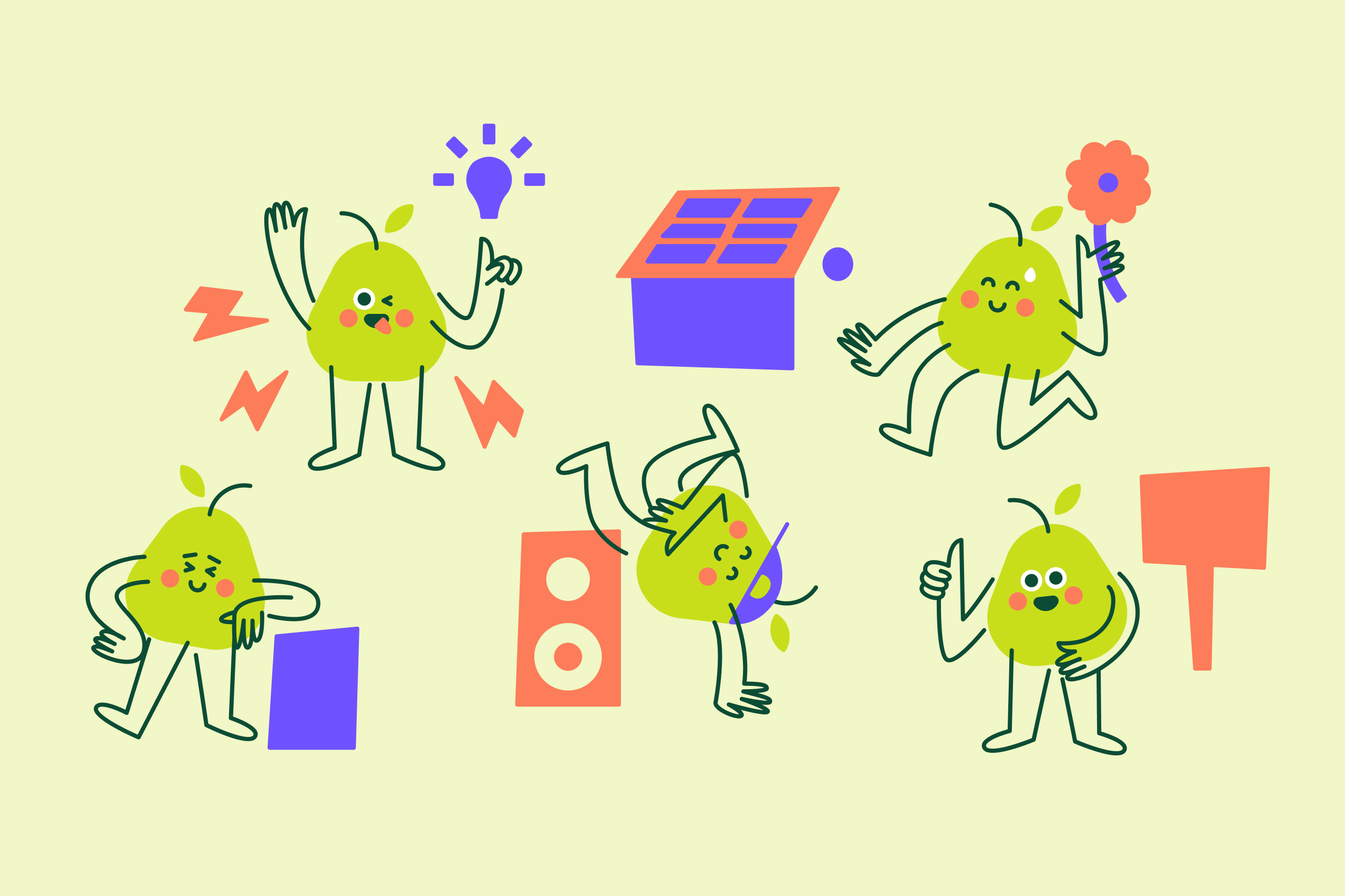
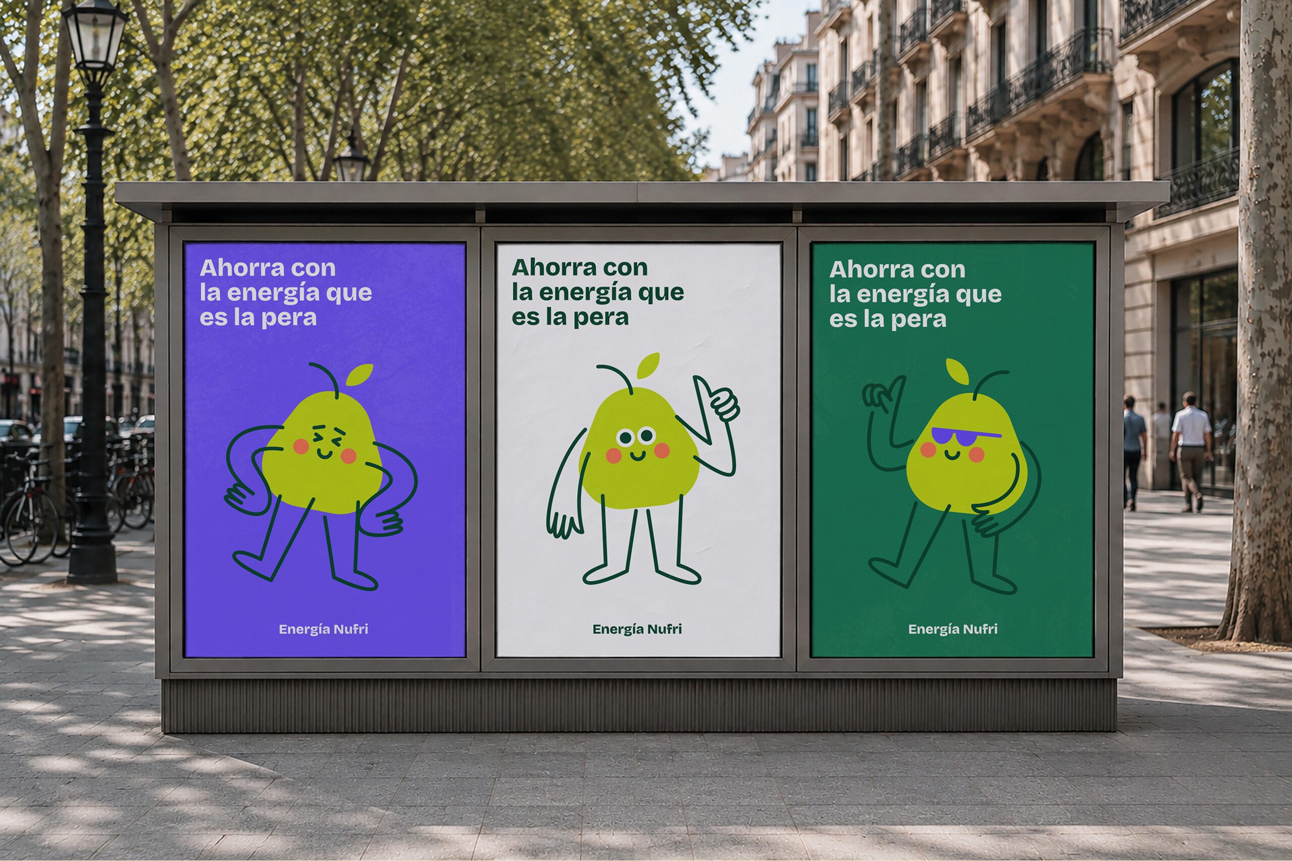
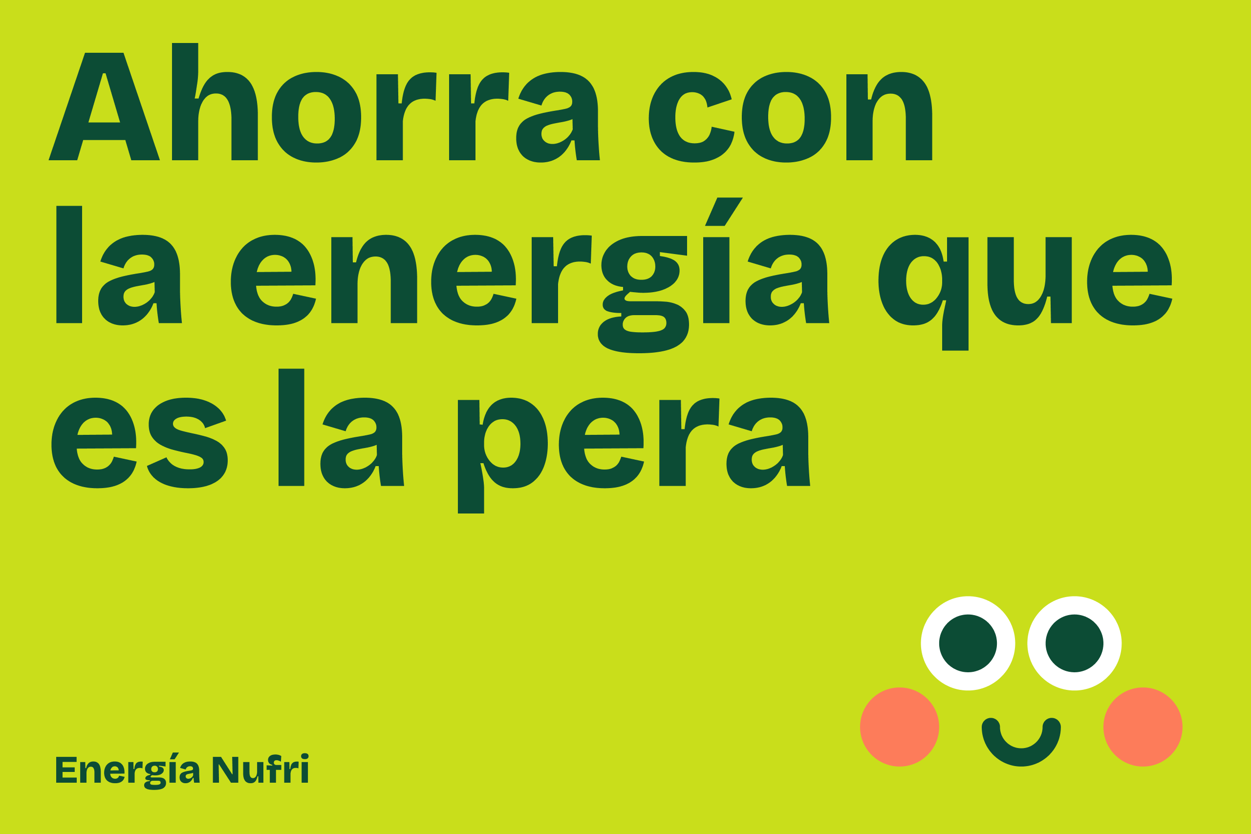
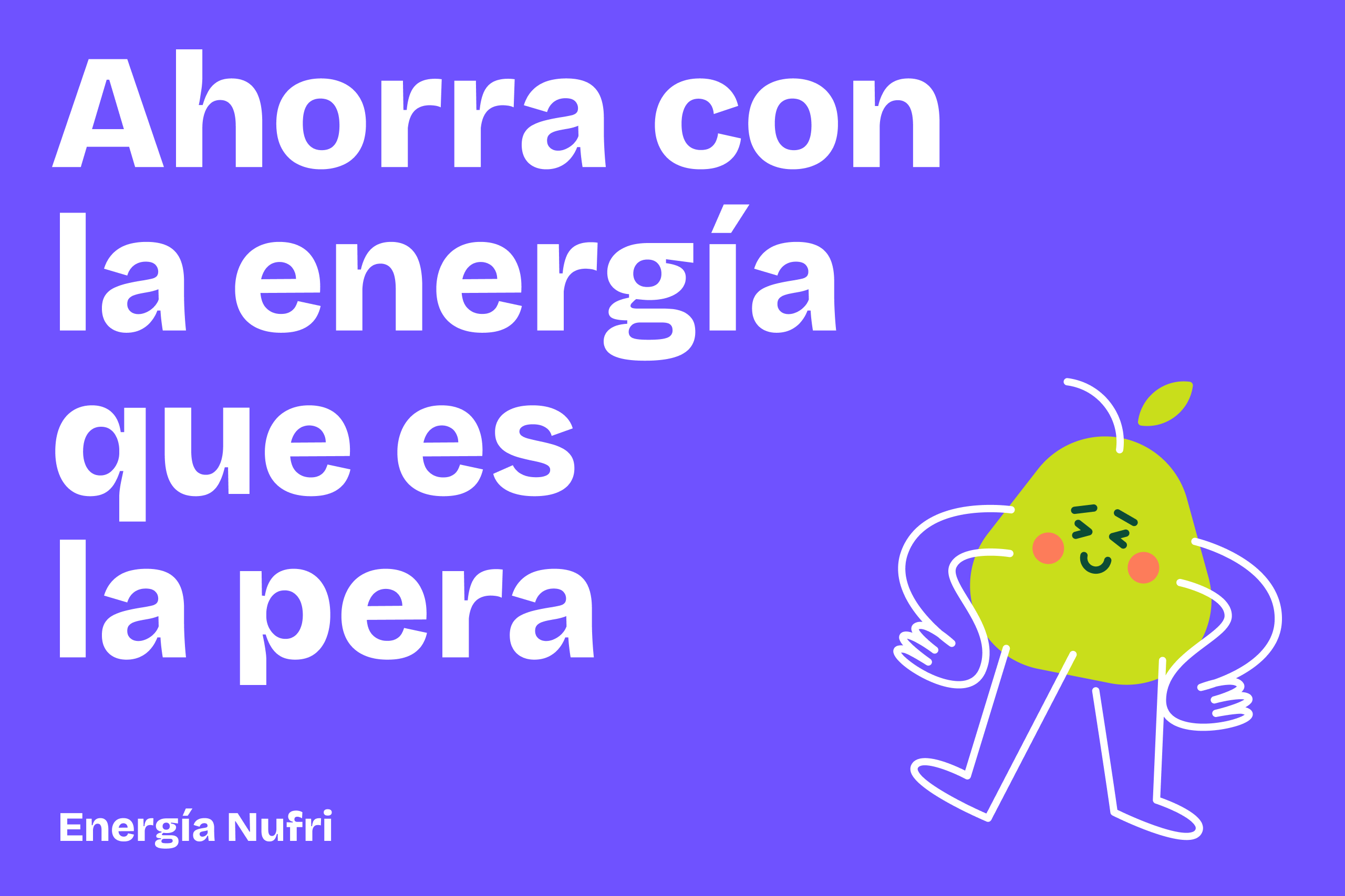
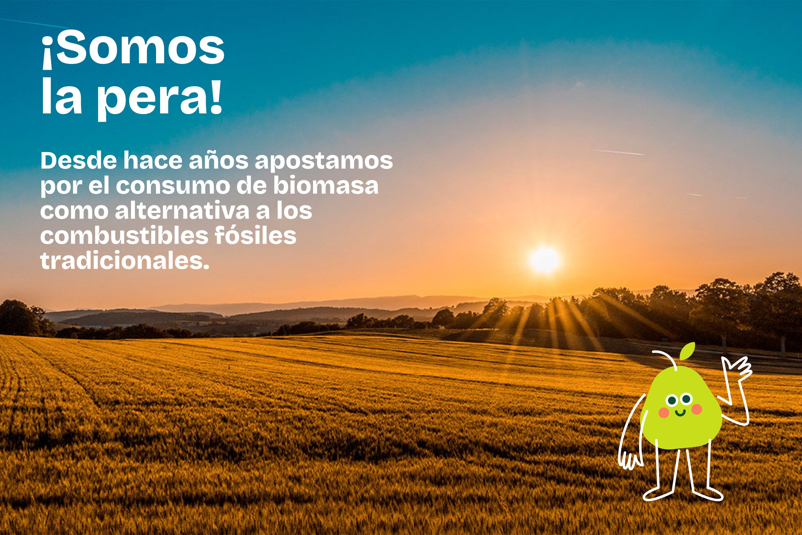
Linked to a business group historically connected to the fruit and vegetable sector, the mascot was conceived to bring the brand claim, “La energía que es la pera”, to life. The phrase works as a play on words in both Catalan and Spanish while also subtly connecting with Nufri’s visual identity through the pear shape.
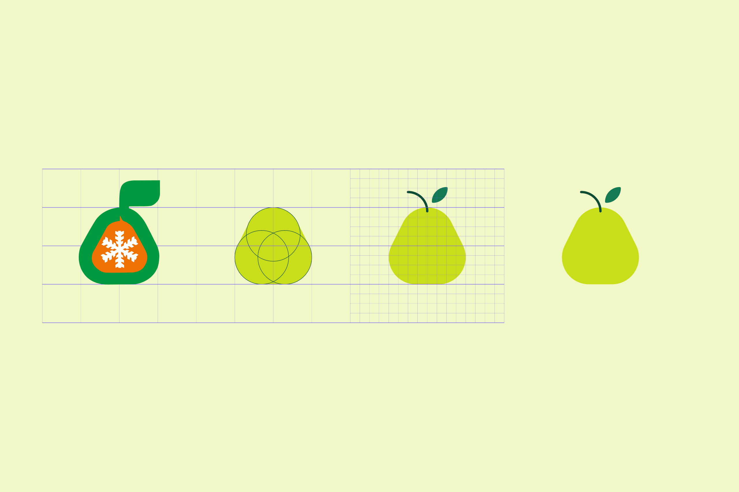
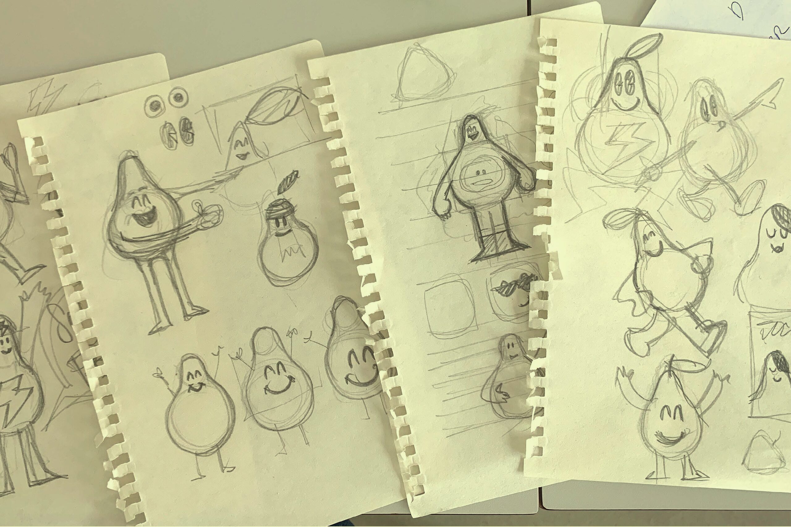
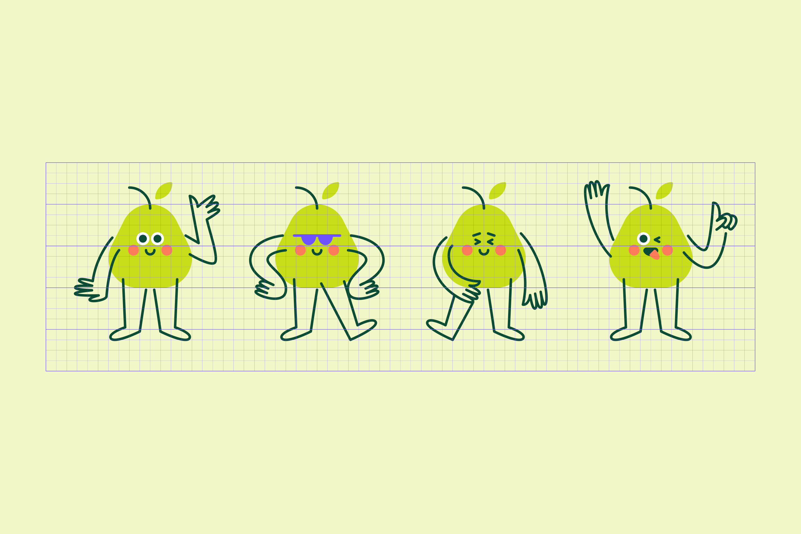
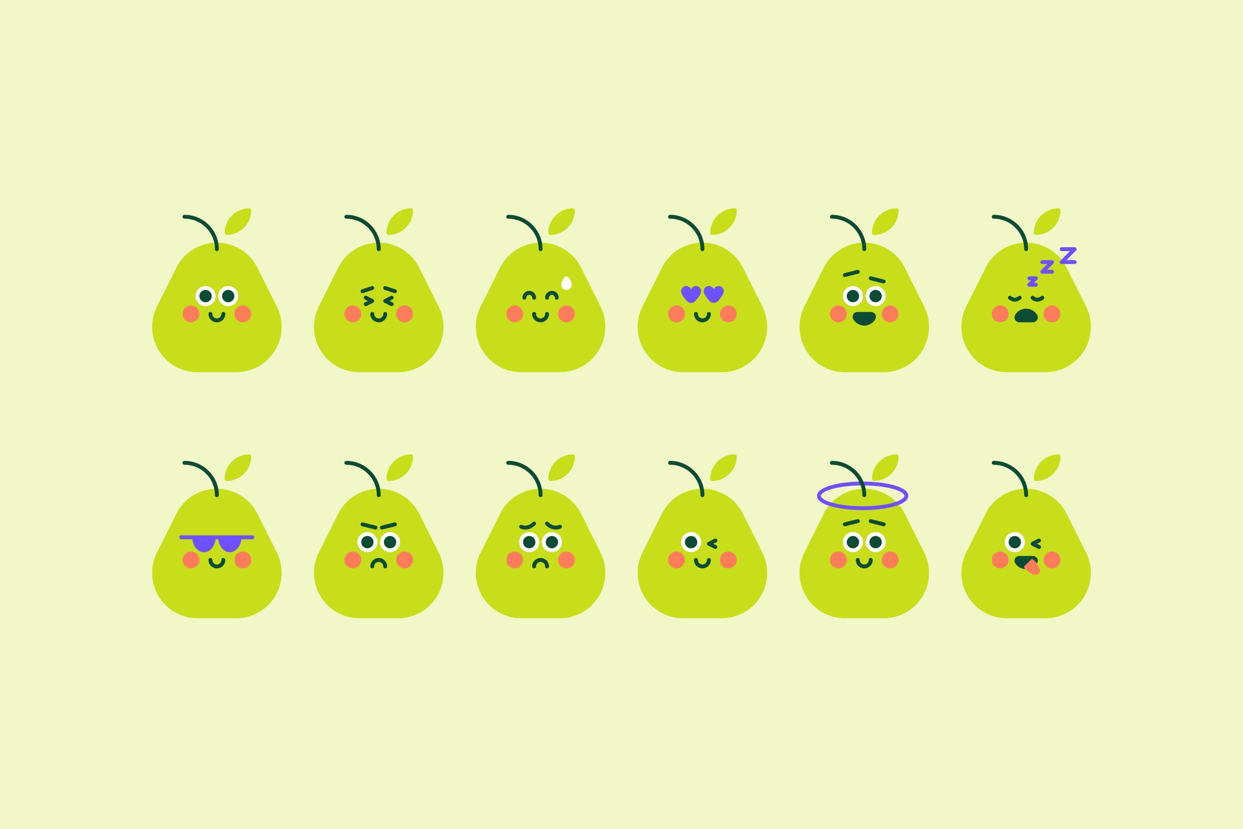
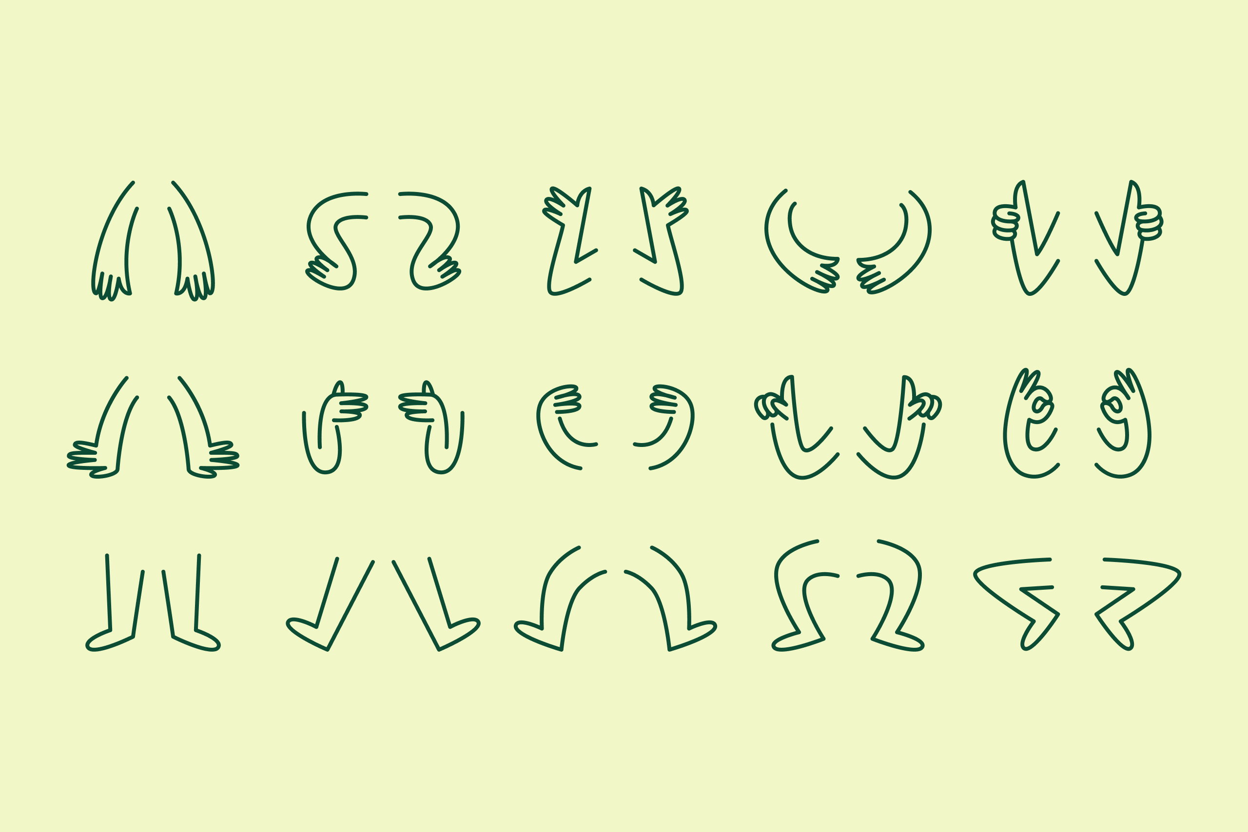
Illustration System
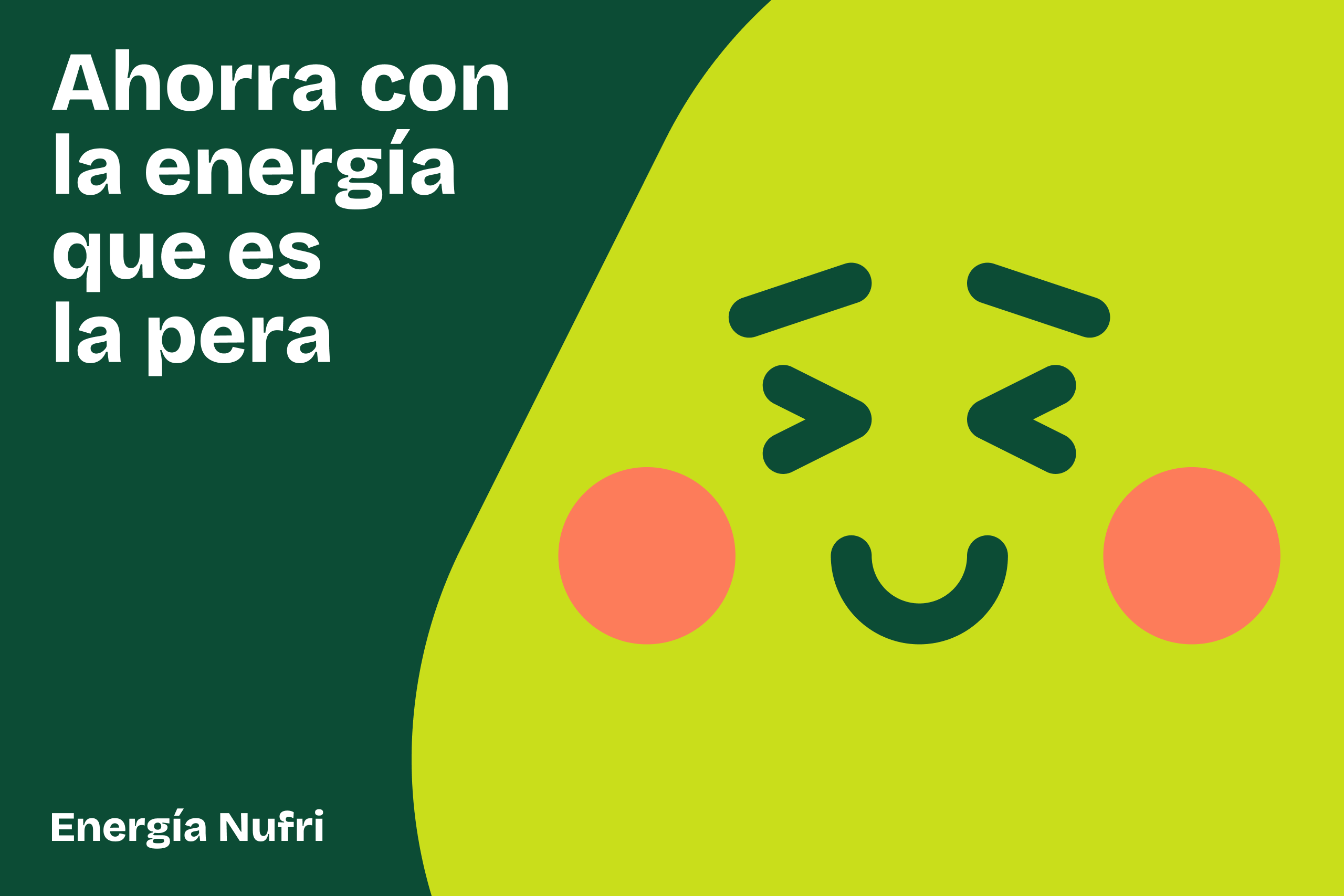
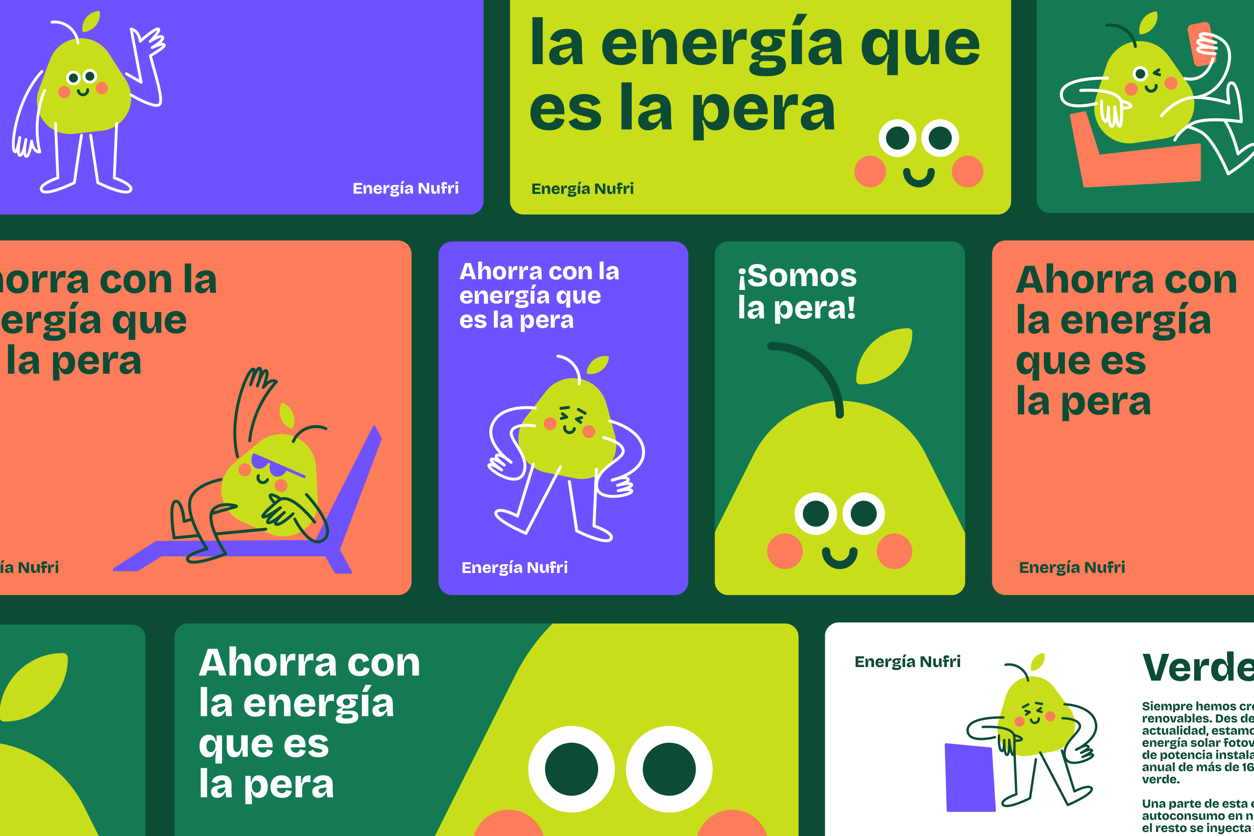
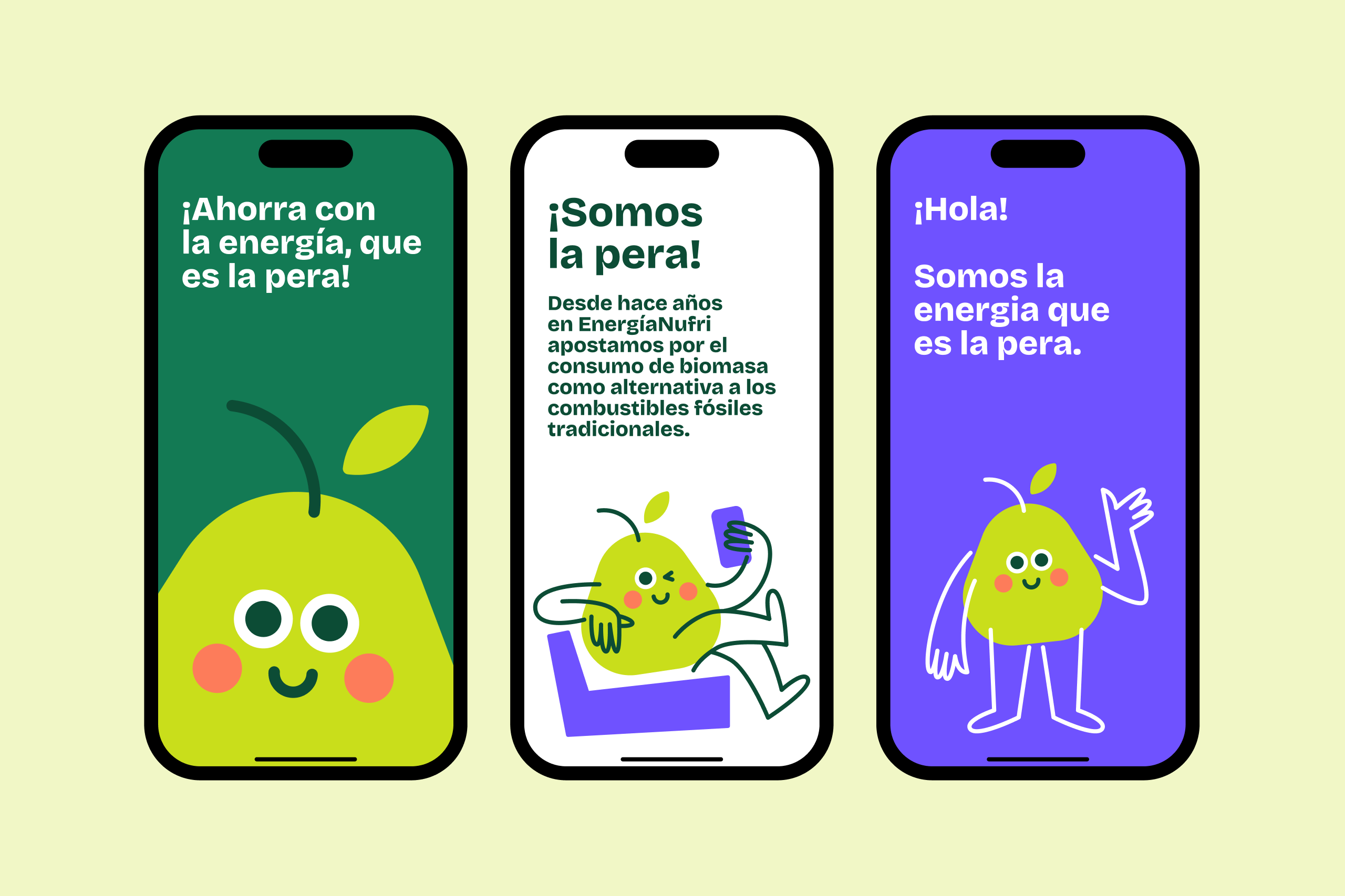
Beyond the character design itself, the project involved creating a modular and flexible illustration system that allows the client to easily generate new poses, expressions, and combinations. Built as a puzzle-like system of interchangeable parts, the mascot can evolve and adapt across different messages, campaigns, and applications while maintaining a consistent and recognizable identity.

The launch was accompanied by a campaign film created by Abuela, bringing the character and its personality into motion as part of the broader brand experience.
Client: Nufri
Agency: Runroom
Art Direction: Runroom + Forma
Character Design: Forma
Spot: Abuela